When the weather finally starts acting like spring, the front door is usually the first place that feels a little tired.
The wreath from winter is still hanging there, maybe a bit lopsided, and everything just looks like it needs a quick refresh.
But nobody wants a big project or a trip to three different stores just to make the entry look decent!
You’re probably looking for something simple that makes the house feel lighter and a little more put together without turning it into a whole thing.
The good news is spring front door decor doesn’t have to be complicated or expensive to look good.
A few easy swaps can make it feel fresh again in an afternoon.
Here are some of my faves:
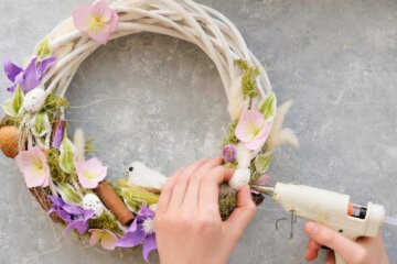
Floral Wreaths and Greenery
Floral wreaths are usually the first thing people think of when they want the front door to feel different for spring.
They’re easy to swap out and don’t require touching anything else on the porch.
One good wreath can make the whole entry look refreshed without dragging out bins from the garage.
1. Tulip Spring Wreath
Tulips have that early spring energy that feels hopeful instead of flashy.
A tulip wreath stacked with soft pinks or buttery yellows makes the door look brighter the second it goes up.
The blooms sit close together, so the shape feels full without sticking out too far.
Against a black or navy door, those colors stand out in a way that’s hard to ignore.
The rounded petals give it a softer look than sharper flowers.
2. Eucalyptus and Lavender Wreath
Eucalyptus leaves bring in that dusty green tone that feels quiet and relaxed.
Lavender adds small hints of purple that don’t overpower everything else.
The mix leans more muted than bold, which works well if bright florals aren’t really your thing.
It pairs nicely with white trim and simple porch lighting.
The thin, layered leaves give it texture without making it heavy.
3. Wildflower Grapevine Wreath
A grapevine base gives this wreath a bit of structure before the flowers even come into play.
Wildflowers in mixed colors make it look less coordinated and more natural.
Tiny pops of blue, yellow, and pink scattered throughout keep your eye moving.
It doesn’t sit perfectly symmetrical, which makes it feel more relaxed.
The uneven clusters of blooms make it look like it was gathered, not arranged.
4. Daisy Spring Door Wreath
Daisies bring that crisp white that really pops against darker paint.
The bright yellow centers draw attention without adding a bunch of extra color.
A ring of daisies spaced evenly around the frame keeps the design balanced.
They feel a little nostalgic in a good way, like something that’s always been part of spring.
The simple petal shape makes the whole wreath look light instead of dense.
5. Fern and Greenery Spring Wreath
Layered ferns add depth with nothing but shades of green.
Long fronds extending slightly past the frame give the wreath a bit of movement.
Different leaf shapes stacked together keep it from looking flat.
It stands out more on doors painted charcoal, navy, or deep green.
The texture from the overlapping leaves does most of the visual work.
Hanging Baskets
Hanging baskets are what people grab when a regular wreath feels a little overdone.
They add shape that hangs lower on the door, which changes the whole look right away.
It feels more layered without adding anything to the steps or porch floor.
6. Floral Hanging Basket Door Decor
A floral hanging basket feels like someone moved a little garden up to eye level.
The flowers spill outward instead of forming a perfect circle, which makes the door look fuller.
Mixed blooms in different heights keep it from looking flat.
The basket itself adds texture, especially if it’s wicker or wire.
It draws attention downward instead of right at the top of the door.
7. Lavender Basket Door Hanger
Lavender in a basket leans softer and a little more subtle.
The muted purple doesn’t compete with bold door colors.
Thin sprigs sticking out at different angles give it movement.
It looks especially good on white, sage, or light gray doors.
Add a little birdhouse to make it super cute!
8. Wildflower Basket Door Arrangement
Wildflowers in a basket feel loose and less structured.
Different colors scattered throughout keep it from looking too matched.
Some blooms sit higher while others drape slightly over the edge.
It adds color without covering the entire door panel.
The uneven layout makes it feel more natural than symmetrical designs.
9. Rustic Greenery Hanging Basket
All greenery in a basket leans more toward texture than color.
Layered leaves in different shapes give it depth without bright blooms.
It works well with wood doors or homes that already have natural elements outside.
The basket frame adds contrast against smooth paint.
The greenery hanging slightly past the bottom edge changes the silhouette of the door.
10. Daisy Door Basket Decor
Daisies in a basket bring in bright white without filling the whole door.
The yellow centers catch the light more than smaller flowers would.
Clustered together, they create a thicker look near the middle.
A few petals angled outward keep it from looking too tight.
The mix of white and green feels lively without being busy.
Door Signs and Wooden Plaques
Door signs are for anyone who doesn’t want florals but still wants the entry to look different.
They sit flat against the door, so they don’t take up much space or feel bulky.
One sign can shift the tone of the whole porch without adding anything else.
11. Wooden “Hello Spring” Door Sign
A wooden “Hello Spring” sign keeps things simple and straight to the point.
The natural wood grain shows through the paint or lettering, which adds warmth.
Round versions soften the hard lines of the door panels.
Block lettering feels bold, while script styles feel lighter and more relaxed.
The contrast between wood and white or pastel text stands out without extra decoration.
12. Rustic Farmhouse Welcome Plaque
A rustic welcome plaque usually leans darker, with distressed edges or visible knots in the wood.
The lettering tends to be bold and easy to read from the driveway.
It works especially well on homes with black hardware or lantern style lights.
The rectangular shape gives a more structured look than round signs.
13. Floral Painted Spring Door Sign
A floral painted sign brings color in a more controlled way than a full wreath.
Hand painted flowers along the edges frame the wording without taking over.
Soft pinks, blues, or yellows against a light background feel season specific without being loud.
The artwork usually sits flatter against the door, which keeps the look clean.
The mix of lettering and painted detail gives it more personality than plain wood.
14. Bunny-Themed Wooden Door Plaque
A bunny plaque leans more into early spring and that in between season before summer.
The silhouette of the bunny keeps it simple instead of cartoonish.
Neutral tones like white, beige, or light gray make it feel less holiday heavy.
It pairs well with simple greenery instead of bright eggs or pastels.
The shape alone signals the season without extra wording.
15. Hand Lettered Spring Welcome Sign
Hand lettered signs bring in personality through the writing style.
Brush script feels casual, while thicker lettering looks more bold and modern.
A slightly imperfect line makes it feel less factory made.
Black lettering on a light background keeps it readable from a distance.
The spacing between words changes the whole feel more than people realize.
Ribbon and Bow Decor
Ribbon and bows are for when you want something on the door but don’t want to hang anything heavy.
They take up space without covering the entire surface.
One good bow can shift the look without changing anything else around it.
16. Spring Door Bow
A single oversized bow in a soft pastel makes a strong statement without adding layers.
Wide ribbon holds its shape better and doesn’t droop against the door.
Placed at the top center, it draws the eye upward right away.
Satin looks smoother and more polished, while cotton feels a little more relaxed.
The tails hanging down create vertical lines that break up flat door panels.
17. Layered Spring Ribbon Door Bow
Layered bows mix patterns and textures in one spot.
A solid ribbon paired with a subtle floral or stripe keeps it interesting without clashing.
Multiple loops give it more volume than a simple tied bow.
Different ribbon widths add dimension instead of one flat shape.
It stands out more on plain doors where there isn’t much else going on.
18. Burlap and Floral Ribbon Bow
Burlap adds rough texture that contrasts nicely with smoother floral ribbon.
The neutral tone of burlap keeps the brighter pattern from taking over.
It works especially well on wood or darker painted doors.
The mix of soft flowers and coarse fabric creates contrast you can see from a distance.
The bow feels slightly heavier visually than satin styles.
19. Gingham Spring Door Bow
Gingham brings in a classic pattern that reads spring right away.
Small checks feel more subtle, while larger checks make a bigger impact.
Soft colors like light blue, pale pink, or yellow keep it seasonal.
The pattern stands out even without extra layers.
It adds structure because the grid is so defined.
20. Spring Floral Door Bow
A floral ribbon bow brings color without needing actual flowers.
The pattern can tie in with planters or nearby decor without matching perfectly.
Brighter blooms printed on ribbon stand out against darker doors.
The loops feel fuller when the pattern repeats across them.
It draws attention to one spot instead of spreading decor across the whole door.
Seasonal Door Hangers
Seasonal door hangers are a little more playful than wreaths or signs.
They usually have a defined shape, which changes the whole outline of the door.
Instead of blending in, they stand out right away.
21. Butterfly Spring Door Hanger
A butterfly hanger brings in movement even though it’s completely still.
The wings spread wider than a wreath would, which makes the door feel bigger.
Bright colors on the wings draw attention immediately.
Painted details or layered wood give it dimension instead of looking flat.
The shape alone signals spring without any extra wording.
22. Umbrella Door Hanger
An umbrella hanger leans into that rainy spring vibe without feeling gloomy.
The curved handle adds a different line than most door decor.
Florals spilling out of the top change the focus upward instead of in a circle.
Pastel colors keep it tied to the season.
The vertical shape breaks up the usual round decor people expect.
23. Easter Egg Door Hanger
An oversized egg shape makes a bold focal point right in the center of the door.
Patterns like stripes, polka dots, or florals add personality without needing extra pieces.
Soft pastel shades feel connected to early spring instead of summer.
The rounded edges contrast nicely with rectangular door panels.
It takes up enough space that nothing else really needs to compete with it.
24. Watering Can Spring Door Decor
A watering can hanger brings in that garden theme without using a wreath.
The metal or painted finish adds texture that looks different from wood signs.
Florals or greenery spilling from the top shift the eye upward.
The handle and spout create angles you don’t usually see on front doors.
It feels more shaped and structured than round decor.
Simple Spring Touches for the Front Door
The front door doesn’t need a full theme or a dozen matching pieces to feel like spring showed up.
One solid choice that stands out is usually more than enough.
A wreath, a basket, a sign, or even just a bow can shift the whole look without touching anything else.
Pick the one that feels right for the house and let the door do the rest!