Floral bedding can go one of two ways real fast. It either feels sweet and cozy…or like a guest room from 1997 that no one’s touched since!
If the goal is something that feels fresh without looking like a flower shop exploded on the bed, the trick is picking the right style and keeping the rest simple.
You don’t need to redo the whole room.
Most of the time it’s just about scale, color, and what you pair it with.
Big dramatic blooms hit different than tiny ditsy prints.
Vintage florals feel softer and a little collected.
Modern ones usually have more contrast and cleaner lines, so they don’t read overly feminine or busy.
And the good news is you don’t have to overthink it!
A few smart swaps, the right mix of pillows, and maybe toning down what’s happening around the bed can completely change the vibe without turning it into a whole project.
Vintage Floral Bedding
Vintage floral bedding has that soft, slightly worn-in feel that makes a room look lived in instead of staged.
The colors usually lean muted, like they’ve been washed a hundred times in the best way, and the prints feel smaller and more detailed.
It’s the kind of look that works even if the rest of the room isn’t perfect, because it’s not trying to be modern or trendy in the first place.
1. Soft Cottage Rose Bedding
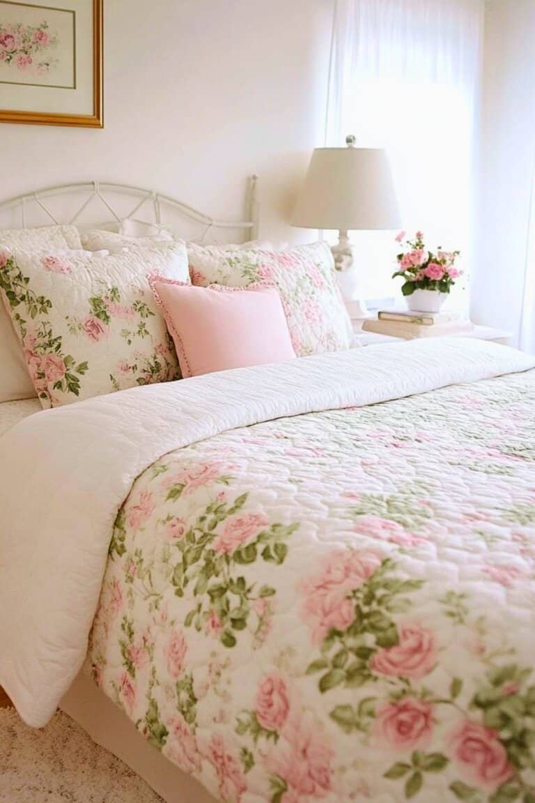
This is the sweet, tiny rose print that feels like it belongs in a cozy little farmhouse with creaky floors and a stack of old books on the nightstand.
The background is usually cream or soft white, and the florals are small enough that the bed doesn’t overwhelm the room.
It pairs really well with simple white sheets and maybe one textured throw at the end so it doesn’t feel too matched.
If the furniture is older or wood-toned, this kind of print just blends right in without competing.
2. Faded English Garden Floral Set
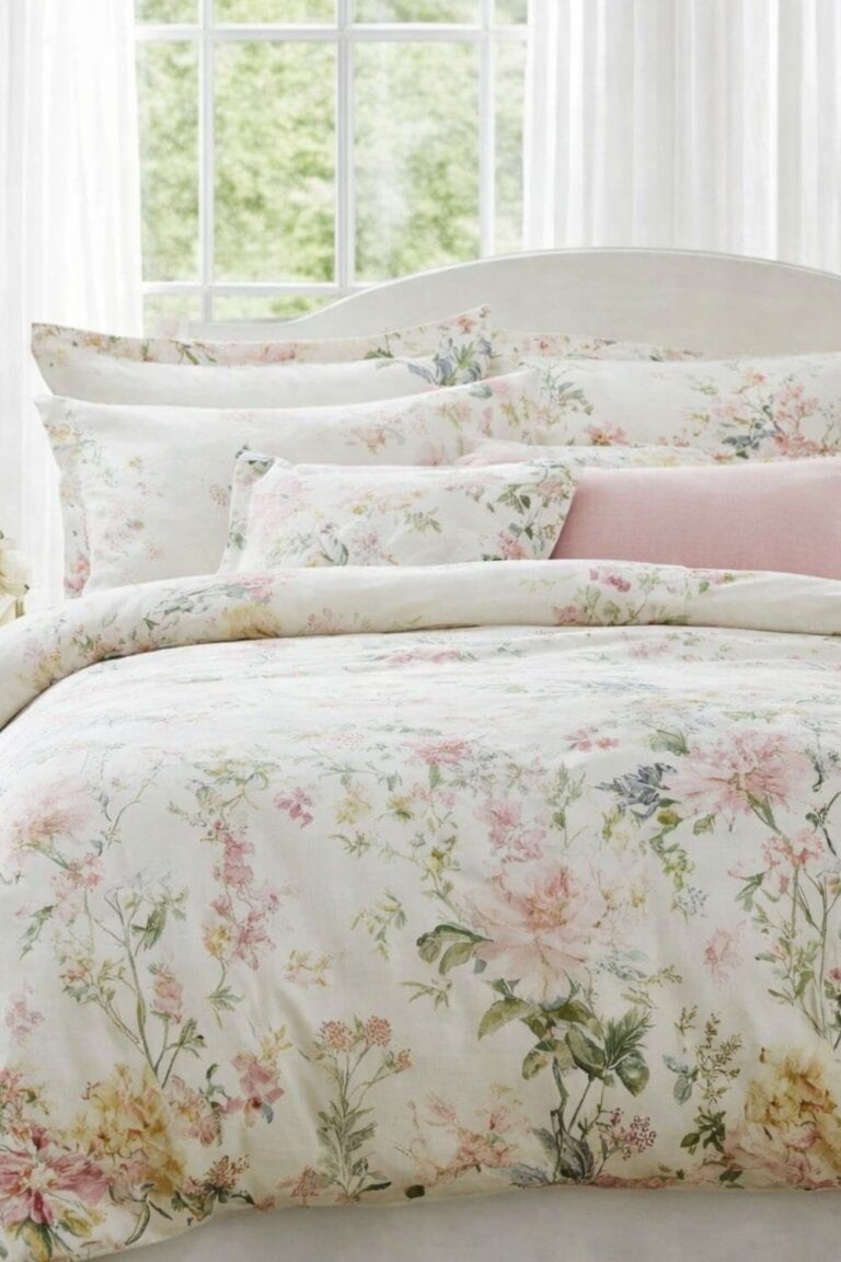
This one usually has slightly larger blooms, but the colors are toned down so nothing feels loud.
The whole vibe is soft and romantic without tipping into frilly.
It works best when the walls are neutral, because the bedding becomes the main focus without needing anything else fancy around it.
A couple of solid pillows in one of the deeper colors from the print helps it look intentional instead of accidental.
3. Antique Wildflower Patchwork Quilt
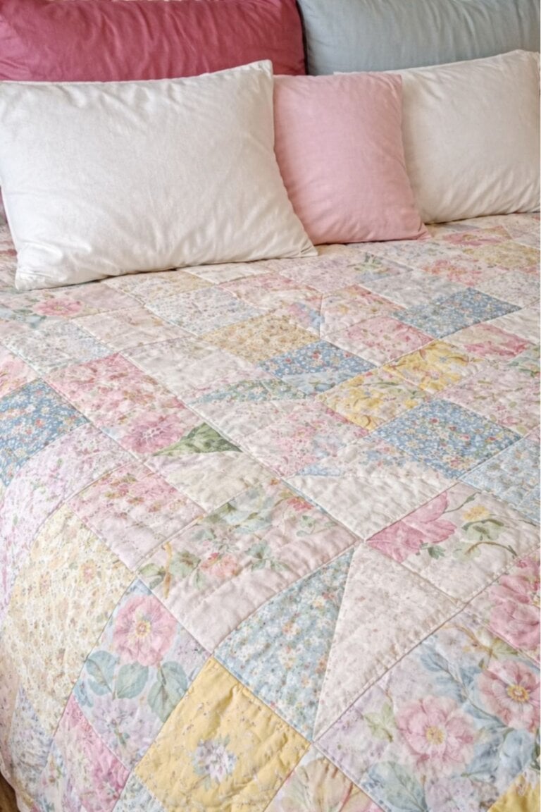
Patchwork florals feel layered and collected, like something that’s been around for years.
All the different little prints break up the space so it feels interesting but not chaotic.
This is a good option if the rest of the room is pretty simple and needs some personality.
It looks especially nice folded halfway down the bed with crisp sheets underneath so it doesn’t feel too heavy.
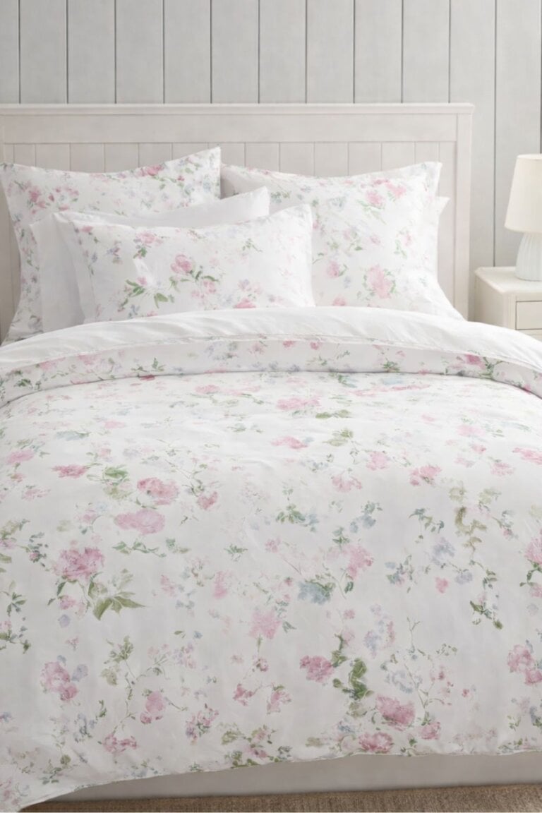
4. Dusty Pink Vintage Peony Comforter
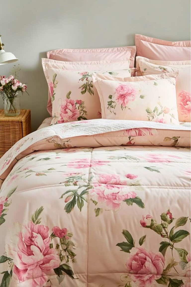
Peonies can feel dramatic, but in dusty pinks and muted greens they soften right up.
The larger blooms make a statement without feeling trendy or bright.
Keeping the rest of the bedding white or cream helps balance it so the room doesn’t start looking busy.
It’s an easy way to add color if the space feels flat but you don’t want anything bold.
5. Blue Toile Floral Bedding
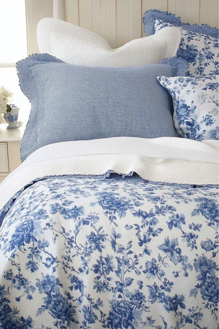
Toile has that classic country feel, but in blue and white it stays clean and timeless.
The detailed scenes and florals add interest without introducing a bunch of different colors.
It works really well in rooms that already have traditional furniture or brass accents.
Adding a simple knit throw or a couple of solid navy pillows keeps it from feeling too formal.
6. Classic Laura Ashley Inspired Floral Set
This style leans traditional, with soft florals scattered across a light background.
The prints usually mix a few colors together, but they’re muted enough that nothing feels harsh.
I love this look because it feels nostalgic without looking stuck in the past.
As long as the rest of the room stays simple, the bedding does all the talking without taking over.
Modern Floral Bedding
Modern florals feel cleaner and a little more graphic.
The prints are usually bigger, more spaced out, or simplified so they don’t look fussy.
This style works well in rooms that already feel pretty minimal and just need something interesting on the bed.
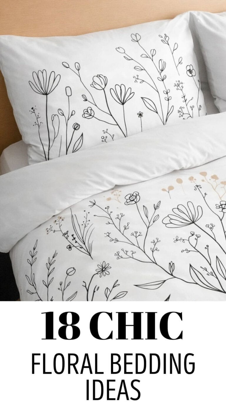
7. Minimalist Line Art Floral Duvet
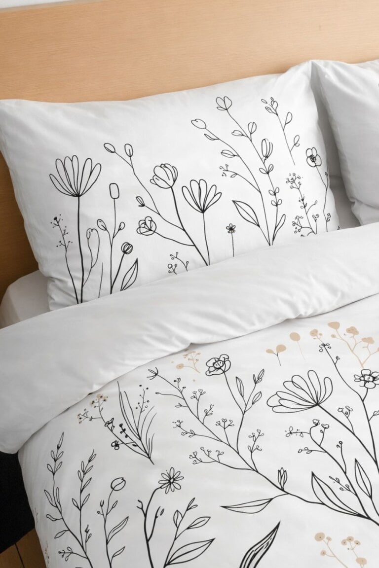
This one keeps it simple with thin outline drawings instead of full-color blooms.
It usually sticks to black on white or soft neutral tones, so it feels calm and uncluttered.
The negative space is what makes it work, because the design isn’t crammed across every inch.
It pairs really well with solid sheets and maybe one textured pillow so the bed doesn’t look flat.
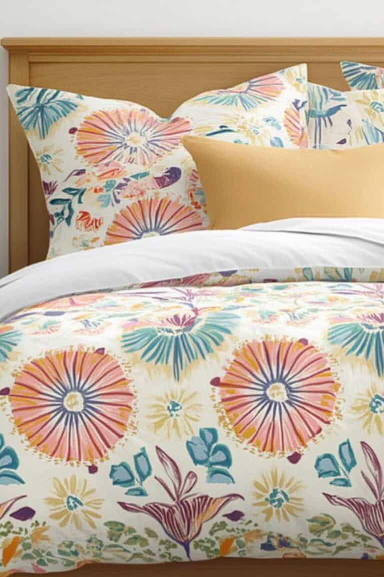
8. Bold Oversized Floral Comforter
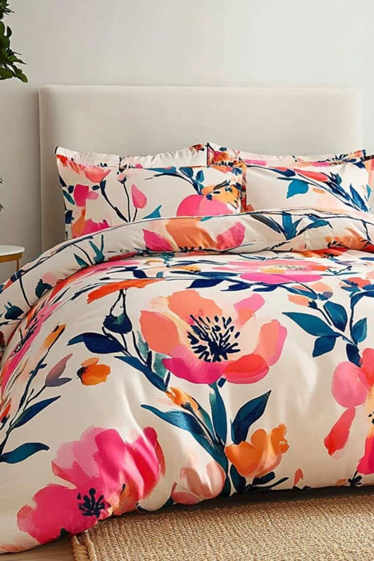
This is where the flowers are big, like one or two blooms taking up half the comforter.
The scale makes it feel modern instead of sweet.
It works best when the rest of the room is toned down, because the bed is clearly the main focus.
Keeping the surrounding decor simple helps it look intentional instead of overwhelming.
9. Neutral Botanical Print Bedding
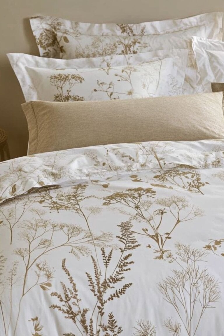
Sometimes I love soft beige, taupe, sage, or charcoal instead of bright pinks and reds!
The floral pattern is there, but it blends into the room instead of jumping out.
This is a good option for someone who wants pattern but still likes a calm space.
Layering it with textured throws or linen sheets adds depth without adding more color.
10. Black and White Floral Bed Set
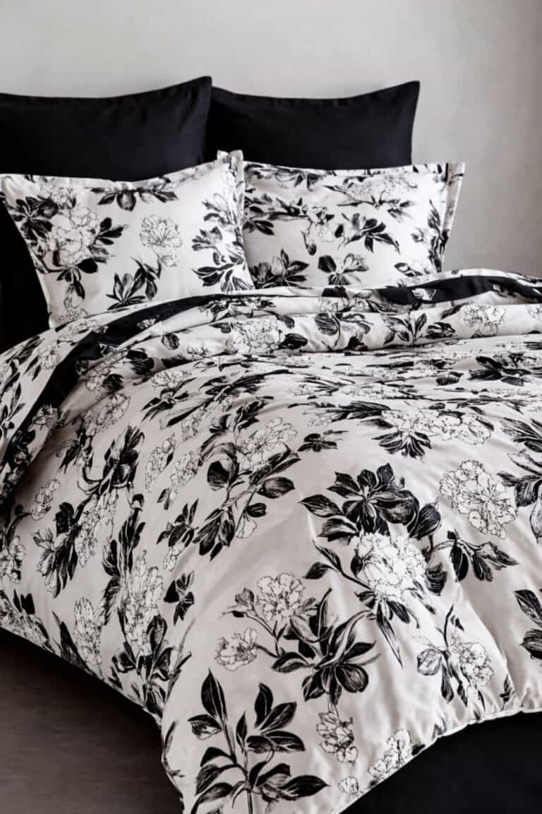
Black and white florals feel crisp and bold without being colorful.
The contrast gives it a sharper look that works well in modern or slightly edgy spaces.
It’s easy to mix with other black accents in the room so everything feels tied together.
Adding one small pop of color, like a muted green plant or a single accent pillow, keeps it from feeling too stark.
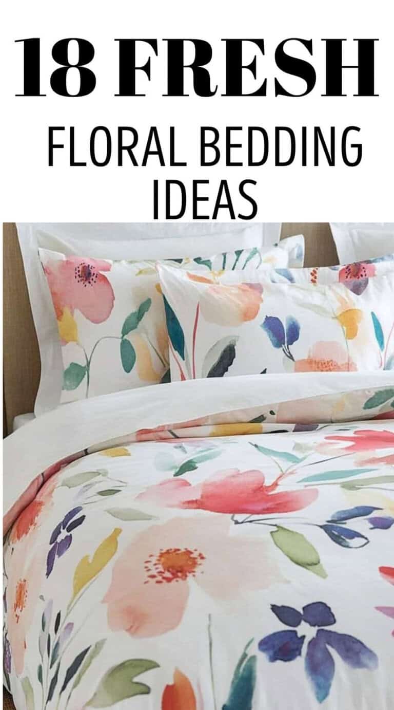
11. Abstract Watercolor Flower Bedding
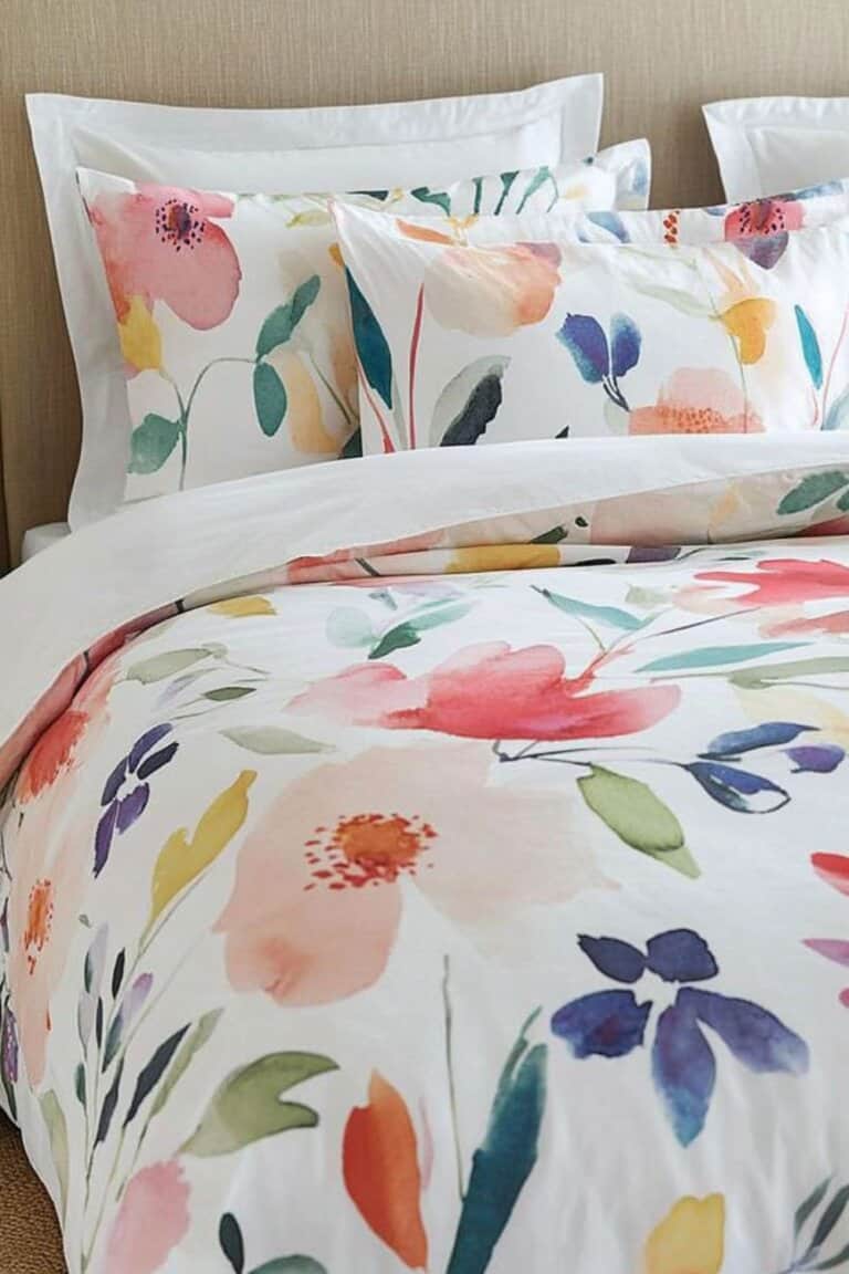
This style feels softer but still modern because the florals aren’t perfectly defined.
The colors usually bleed into each other a little, which keeps it from looking traditional.
It works especially well in rooms with light walls and simple furniture.
Sticking to two or three colors in the rest of the bedding helps it feel cohesive instead of busy.
12. Scandinavian Style Floral Duvet
Scandinavian florals tend to be simple, spaced out, and slightly playful without being loud.
The colors are often muted with one deeper accent shade mixed in.
There’s usually a lot of white space, which keeps the whole bed feeling airy.
Paired with natural wood tones and clean lines, it gives the room a fresh but relaxed look.
Unique Floral Bedding
These are the floral options that don’t fall into sweet cottage or clean modern.
They’ve got a little personality, sometimes a little drama, and they don’t try to blend in.
If the room feels flat or safe right now, this is where things start getting interesting.
13. Dark Moody Floral Bedding
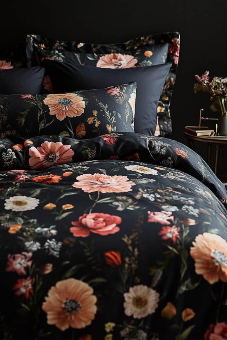
This is deep backgrounds like charcoal, navy, or even black with rich florals layered on top.
The darker base makes the flowers feel dramatic instead of delicate.
It works really well in rooms with lighter walls because the contrast feels intentional.
Adding softer textures like velvet or knit keeps it from feeling too heavy.
14. Boho Flower Bedspread
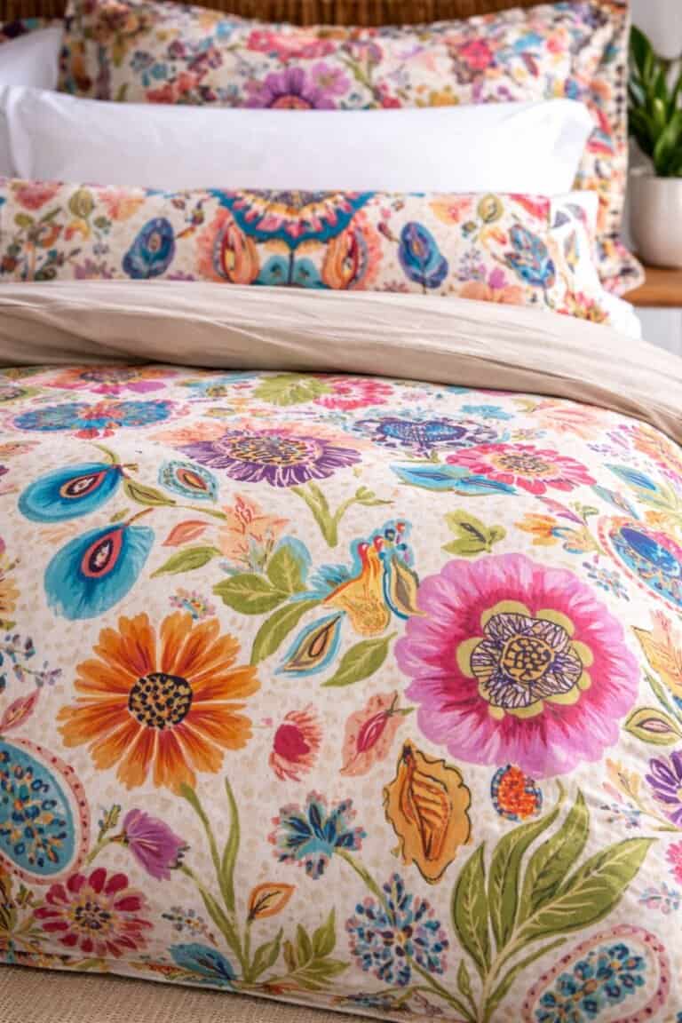
Boho florals usually mix larger prints with earthy tones like rust, mustard, and muted teal.
There’s often a slightly relaxed, imperfect feel to the pattern.
This style looks best when it’s layered with different textures like fringe throws or woven pillows.
It doesn’t need to match perfectly, which is kind of the point.
15. Tropical Floral Bedding Set
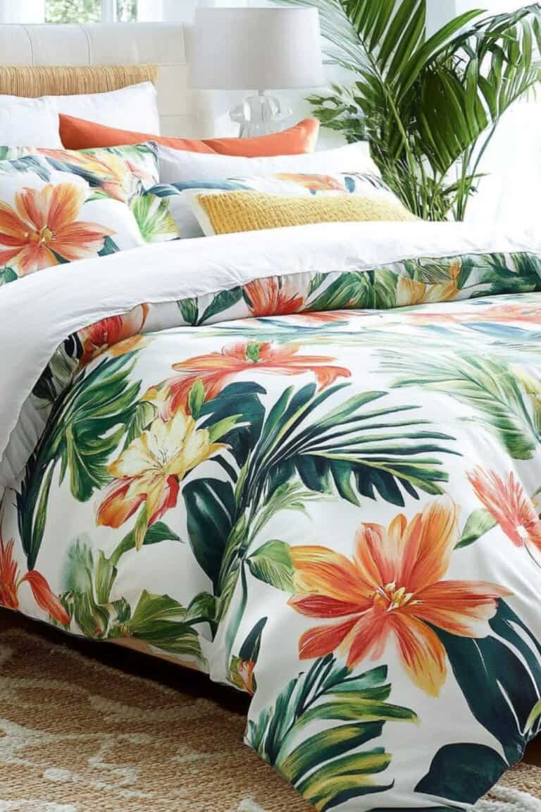
Big leafy prints and bold flowers instantly make the bed the main feature of the room.
The colors tend to be brighter, like greens, corals, or deep pinks.
This works best when the rest of the space stays simple so it doesn’t turn into theme decor.
Keeping the walls neutral helps the bedding feel fun instead of overwhelming.
16. Mushroom and Floral Bedding
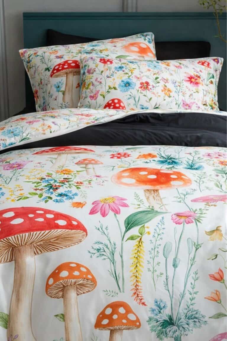
This one leans a little whimsical with tiny mushrooms mixed into the florals.
It feels cozy and slightly woodland without going full storybook.
The smaller details make it interesting up close but still calm from across the room.
Pairing it with soft neutrals keeps it from feeling too busy.
17. Geometric Floral Bedding
Here the florals are structured, sometimes mixed with shapes or repeating patterns.
It feels more graphic and less traditional because the design has clear lines.
This is a good choice for rooms that already have modern furniture but need something less plain.
Keeping the color palette tight helps it feel intentional instead of chaotic.
18. Stripes and Floral Bedding
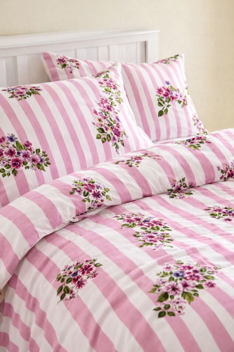
Mixing stripes with florals adds contrast and keeps things from feeling too soft.
The stripes usually ground the pattern so the flowers don’t take over.
It’s an easy way to make floral bedding feel less predictable.
Sticking to coordinating colors between the stripes and florals keeps the whole bed looking pulled together.
Florals Without the Grandma Vibes
Florals only feel dated when everything else in the room is fighting them.
Keeping the walls, furniture, and extra decor simple makes even the most traditional print feel current.
It usually comes down to scale and color, not the fact that there are flowers on the bed.
Pick something you actually like looking at every day, tone down the extras, and let the bedding do its thing without turning the whole room into a theme!